Enter Signs At MIA: Logical Sign Design Win!
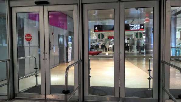
Miami Airport Doors with “Do Not Enter” & “Enter” Signs
When I was in Miami Beach recently I flew in and out through Miami International Airport aka MIA and when I was going in and out of the airport I noticed their “Enter” signs on the airport doors were different than any I had ever seen before. Usually this is unremarkable and I wouldn’t think anything more of it aside from mentally acknowledging which was the correct door to enter/exit as I was walking. The difference here was that unlike most other “Enter” signs I have seen in my life, this sign was an almost exact opposite version of the “Do Not Enter” sign we are all familiar with from all over the world.

Do Not Enter Road Sign – Toronto, Ontario, Canada
Pretty much everyone in the world recognizes the above sign as a “Do Not Enter” or “No Entry” sign. The red circle with the white line going almost all the way across it is a universal symbol which we all understand no matter which language we speak. This is why I was so impressed with the sign that someone had come up with for the Miami International Airport doors. It wasn’t an exact opposite because for some reason they designed it to have the white line go all the way through the circle instead of leaving it a bit smaller than the circle but otherwise it is the same.

My initial reaction is to assume that they put this sign up because of all the Latin American traffic that comes through Miami International Airport but I wonder why I haven’t seen it in more places. Apparently they use a similar sign in Denmark for instructing drivers on their roads as I found here so I’d imagine this sign is also used elsewhere in the EU. That still leaves the question of how the heck it ended up on the doors of Miami International Airport and yet nowhere else in Miami (that I saw) but at least it’s a start!

I do still wonder why these signs are not more widespread across North America, especially Canada where we are officially a bilingual country.

Why do our doors in Toronto have this sign (above) on them on them yet the same set of doors have an arrow (below) in a white circle outlined in green and an English word to indicate where to go in?
![]()
Why do we think the arrow and a word communicates where to go better than the opposite of the Do Not Enter sign we are already training society to recognize? The green outline surrounding the white circle with the arrow in it shows the sign makers are aware that green is understood immediately as the sign to proceed and it is the opposite of the red on the No Entry signs. Using the sign I noticed at the Miami airport just makes sense from a user experience perspective! (I always like to applaud good UX design when I see it, even in such mundane settings as this.)
Maybe one day we will start seeing these way more logical and intelligently designed Enter signs in Canada and the USA but until then, I’ll just appreciate the good work someone (or some people) at the Miami International Airport signage division is doing in their selection of these logical signs.
Have you ever seen signs like these in your city or in your travels? Have you seen other examples of unique, logical signage? What were they and where’d you see them? Let me know in the comments!

